In the first part of this post, I demonstrated how beta and quasi-binomial regression can be used with dependent variables that are proportions or ratios. I applied these models to attendance rates of the German Handball-Bundesliga. In the second part, I want to investigate whether attendance increased after the World Championship that took place in January 2019 in Denmark and Germany (with a new spectator record). It is often suggested that such tournaments have an impact beyond the event itself, and the following analyses are aimed to shed light on this for the present example.
library("conflicted")
suppressPackageStartupMessages(library("tidyverse"))
conflict_prefer("filter", "dplyr")
#> [conflicted] Will prefer dplyr::filter over any other package
library("betareg")
library("broom")
theme_set(theme_light(base_size = 12))
theme_update(panel.grid.minor = element_blank())

transform_perc <- function(percentage_vec) {
    # See Cribari-Neto & Zeileis (2010)
    (percentage_vec * (length(percentage_vec) - 1) + 0.5)/length(percentage_vec)
}
Data
Data were obtained for the current and the last two seasons from https://www.dkb-handball-bundesliga.de, and the R code for wrangling and cleansing the data is available on my Github.
# Show some data
select(df1, rowid, year, Date, home_team, away_team, attendance, capacity, perc) %>%
    sample_n(5)
#> # A tibble: 5 x 8
#>   rowid year  Date       home_team    away_team   attendance capacity  perc
#>   <int> <fct> <date>     <fct>        <fct>            <dbl>    <dbl> <dbl>
#> 1    62 16/17 2016-10-07 TBV Lemgo L~ SG Flensbu~       4059     4861 0.835
#> 2   763 18/19 2018-12-15 TSV GWD Min~ FRISCH AUF~       3282     4059 0.809
#> 3   117 16/17 2016-11-25 Füchse Berl~ MT Melsung~       6439     9000 0.715
#> 4   811 18/19 2019-03-02 SG Flensbur~ TBV Lemgo ~       6300     6300 1
#> 5   600 17/18 2018-05-27 HSG Wetzlar  TBV Lemgo ~       4312     4412 0.977
First, let’s compare the attendance rates in the first half of the season (Sep–Dec) with those from the second half (Feb–Jun) descriptively. As seen below, the attendance rates are always a little bit higher in the second half, but the difference is much more pronounced in the current season. Before the World Championship, the average attendance rate was 76 % which rose to 84 % after the World Championship.
Even though this looks like there was some effect, these descriptive values should be treated with caution because several variables need to be controlled for in an appropriate statistical model as done below.
df1 %>%
  filter(date < "2019-05-01") %>%
  group_by(year, half2) %>%
  summarize(M = round(mean(perc), 2))
#> # A tibble: 6 x 3
#> # Groups:   year [3]
#>   year  half2     M
#>   <fct> <dbl> <dbl>
#> 1 16/17     0  0.8
#> 2 16/17     1  0.81
#> 3 17/18     0  0.78
#> 4 17/18     1  0.81
#> 5 18/19     0  0.76
#> 6 18/19     1  0.84
In the models, I will control for a bunch of variables that are all categorical, and I use coding schemes tailored to my hypotheses and analyses as defined in the following
df2 <- filter(df1, date < "2019-05-01") %>%
  # Calculate average attendance per round for plotting
  group_by(year, round_number) %>%
  mutate(avg = mean(perc)) %>%
  ungroup %>%
  mutate(y = transform_perc(perc),
         # Helmert coding of 'year'
         year2 = as.numeric(recode(year, "16/17" = -.5, "17/18" = .5, "18/19" = 0)),
         year3 = as.numeric(recode(year, "18/19" = 2/3, .default = -1/3)),
         # Interaction effects of year X 2nd-half-of-the-season
         ix1 = half2*year2,
         ix2 = half2*year3)

# Effect coding
contrasts(df2$home_team) <- contr.sum(levels(df2$home_team))
contrasts(df2$away_team) <- contr.sum(levels(df2$away_team))

# Dummy coding
contrasts(df2$weekday) <- contr.treatment(7, base = 6)
Analyses: Beta and Quasi-Binomial Regression
The analyses reported in the first post revealed that a quasi-binomial and a beta model fit the data best. (The beta was slightly inferior but it has the advantage that prediction intervals—if desired—can be obtained.) In the following, I fit these two models and include, among other predictors, the following terms:
half2captures differences between the first half of the season (Oct–Dec) and the second half (Feb-Jun) across all three seasons.year2captures differences between the second (2017/18) and the first (2016/17) season, andix1is the interaction ofhalf2andyear2.year3captures differences between the third season (2018/19) on the one hand and the earlier two seasons on the other hand via Helmert coding.ix2is the interaction ofhalf2andyear3.- The variables
Oct,Nov, etc. control differences between months within a half and are of secondary importance (see also my R code for data wrangling).
Thus, a sizable, positive effect of ix2 indicates that the attendance rate after the World Championship in 2019 was larger compared to the attendance rates in the same time period in the two seasons before.
res1 <- list()
res1$Beta <-
    betareg(y ~ home_team + away_team + weekday + Oct + Nov + Dec + Mar + Apr + May +
                half2 + year2 + year3 + ix1 + ix2 | home_team, data = df2)

res1$Quasibinomial <-
    glm(perc ~ home_team + away_team + weekday +
            Oct + Nov + Dec + Mar + Apr + May +
            half2 + year2 + year3 + ix1 + ix2, data = df2,
        family = quasibinomial(logit), weights = capacity)
Results
The coefficients from both models shown below indicate that attendance rates are larger in the second half of the season (by a value of ca. 0.3 logits).
Furthermore, attendance rates were largest in 2016/17 and then slightly decreased (as indicated by the negative signs for year2 and year3).
Most importantly, there is a positive interaction effect ix2 indicating that attendance after January was higher in 2019 compared to the years before.
It seems reasonable to conclude that this increase is due to the World Championship that took place in January 2019.
The effect is larger in the quasi-binomial model than in the beta model.
Furthermore, note that p-values are of secondary importance here, because the data are in fact population data (i.e., no sampling error).
tidy(res1$Beta) %>% mutate_if(is.numeric, round, 3) %>% slice(1, 56:60)
#> # A tibble: 6 x 6
#>   component term        estimate std.error statistic p.value
#>   <chr>     <chr>          <dbl>     <dbl>     <dbl>   <dbl>
#> 1 mean      (Intercept)    1.85      0.084    22.1     0
#> 2 mean      half2          0.306     0.054     5.71    0
#> 3 mean      year2         -0.018     0.1      -0.184   0.854
#> 4 mean      year3         -0.082     0.074    -1.12    0.263
#> 5 mean      ix1           -0.246     0.12     -2.05    0.04
#> 6 mean      ix2            0.235     0.122     1.92    0.055
tidy(res1$Quasibinomial) %>% mutate_if(is.numeric, round, 3) %>% slice(1, 56:60)
#> # A tibble: 6 x 5
#>   term        estimate std.error statistic p.value
#>   <chr>          <dbl>     <dbl>     <dbl>   <dbl>
#> 1 (Intercept)    1.75      0.085    20.4     0
#> 2 half2          0.28      0.053     5.31    0
#> 3 year2         -0.159     0.098    -1.62    0.105
#> 4 year3         -0.212     0.071    -2.99    0.003
#> 5 ix1           -0.001     0.119    -0.011   0.991
#> 6 ix2            0.37      0.119     3.10    0.002

(res1 <- enframe(res1, "model"))
#> # A tibble: 2 x 2
#>   model         value
#>   <chr>         <list>
#> 1 Beta          <betareg>
#> 2 Quasibinomial <glm>
Plot
To visualize the effect, I calculate the fitted values (i.e., the model predictions) for the actual data df2.
Furthermore, I calculate these values for imaginary data (newdata) assuming there was no championship effect in the current season.
Thus, these predictions for newdata are the attendance rates that were expected for the second half of the current season based on the data from the years before.
newdata <- df2
newdata[newdata$half2 == 1, "ix2"] <- -1/3

res2 <- res1 %>%
    # Calculate fitted/predicted values
    mutate(fttd1 = map(value, ~augment(.x, data = df2, type.predict = "response")),
           fttd1 = map(fttd1, ~mutate(.x, count = round(.fitted*capacity))),
           fttd0 = map(value, ~augment(.x, newdata = newdata,
                                       type.predict = "response")),
           fttd0 = map(fttd0, ~mutate(.x, count = round(.fitted*capacity))),) %>%
    # Summarize fitted values per month and combine into one tibble per model
    mutate(fttd1M = map(fttd1, ~summarize(group_by(.x, year, Month),
                                          pperc_Observed = mean(.fitted),
                                          pcount_Observed = mean(count))),
           fttd0M = map(fttd0, ~summarize(group_by(.x, year, Month),
                                          pperc_Expected = mean(.fitted),
                                          pcount_Expected = mean(count))),
           fttd   = map2(fttd1M, fttd0M, left_join, by = c("year", "Month")),
           fitted = map2(fttd1, fttd, left_join, by = c("year", "Month")))

# Combine results for beta and binomial into one tibble
res3 <- res2 %>%
    transmute(model = model,
              res = map(fitted,
                      ~pivot_longer(.x, cols = c(pperc_Observed:pcount_Expected),
                                    names_sep = "_",
                                    names_to = c(".value", "newdata")))) %>%
    mutate(res = map2(res, model, ~mutate(.x, model = .y))) %>%
    {bind_rows(.$res)} %>%
    mutate(model = factor(model, levels = c("Quasibinomial", "Beta"),
                          labels = paste(c("Quasibinomial", "Beta"), "Regression")))

# Show some data
select(res3, rowid, year, half2, home_team, attendance = perc, newdata, pperc, pcount) %>%
    slice(1:2, 3443:3444)
#> # A tibble: 4 x 8
#>   rowid year  half2 home_team          attendance newdata  pperc pcount
#>   <int> <fct> <dbl> <fct>                   <dbl> <chr>    <dbl>  <dbl>
#> 1     1 16/17     0 HSG Wetzlar             0.925 Observed 0.753  4448.
#> 2     1 16/17     0 HSG Wetzlar             0.925 Expected 0.753  4448.
#> 3   864 18/19     1 TVB 1898 Stuttgart      1     Observed 0.836  4776.
#> 4   864 18/19     1 TVB 1898 Stuttgart      1     Expected 0.791  4499.
The plot nicely illustrates the championship effect. The green lines represent the predictions for the Observed data, whereas the blue lines represent the predictions that were Expected for these matches based on the data from 2016/17 and 2017/18. As you can see, we expected a decline in February 2019 (blue line), since such a pattern was consistently observed in 2017 and 2018. However, attendance stayed stable in 2019 (green line). Thus, the yellow area indicates the relative increase in attendance after the World Championship in January 2019.
ggplot(res3, aes(x = Date, y = pperc, color = newdata)) +
    facet_grid(model~year, scales = "free_x", switch = "y") +
    # yellow area
    geom_ribbon(data = pivot_wider(res3, id_cols = c(rowid, Date, model, year),
                                   names_from = newdata, values_from = pperc),
                mapping = aes(x = Date, ymax = Observed, ymin = Expected),
                inherit.aes = F, fill = "#FDE725FF") +
    # point for each match
    geom_jitter(aes(y = perc), col = "gray", alpha = .5, height = 0,
                shape = 21, fill = "gray95") +
    # lines corresponding to fitted values, i.e., model-implied predictions
    geom_line(size = 1) +
    scale_color_viridis_d(begin = .3, end = .7) +
    labs(y = "Attendance Rate", color = NULL,
         title = "Increased Attendance Rate in Handball-Bundesliga",
         subtitle = "After World Championship in January 2019") +
    scale_y_continuous(trans = "exp", sec.axis = dup_axis(name = NULL)) +
    scale_x_date(date_breaks = "2 months", date_labels = "%b") +
    guides(color = guide_legend(reverse = TRUE))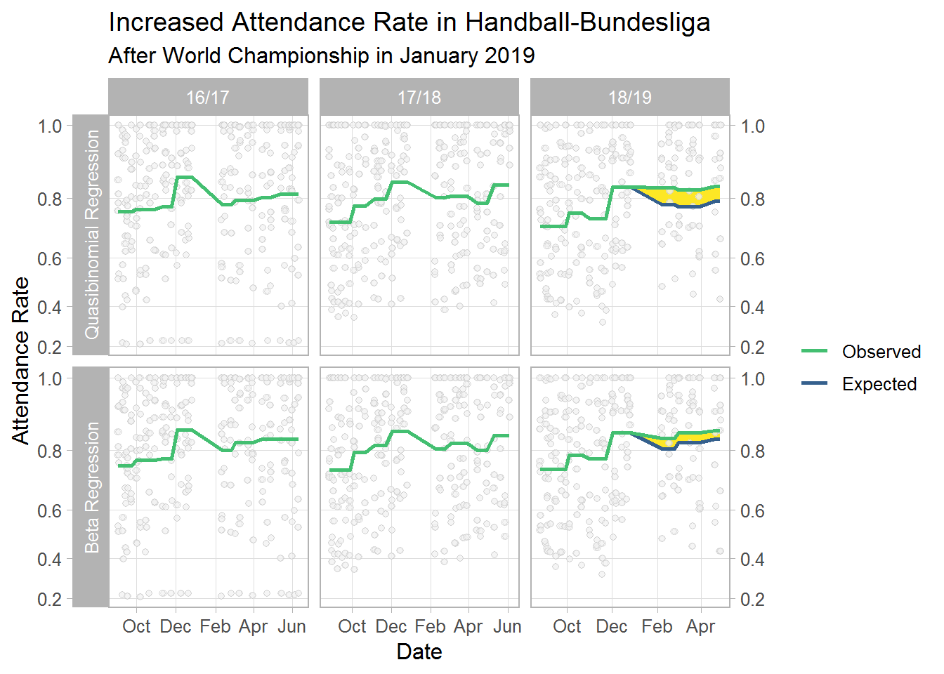
Model Comparison
The analyses in the first post already revealed that the quasi-binomial model may describe the data better than the beta model. Herein, I compare these models again for the present data. The results below confirm the finding from the first post: RMSE and MAE are lower and R squared is higher for the quasi-binomial model.
res2 %>%
    mutate(perf = map(fttd1, ~yardstick::metrics(.x, attendance, count))) %>%
    select(model, perf) %>%
    unnest(perf) %>%
    pivot_wider(model, names_from = .metric, values_from = .estimate)
#> # A tibble: 2 x 4
#>   model          rmse   rsq   mae
#>   <chr>         <dbl> <dbl> <dbl>
#> 1 Beta           787. 0.895  476.
#> 2 Quasibinomial  692. 0.916  433.
Effect Size
To quantify the championship effect, I average over all matches after January 2019 and compare the green and the blue line in the plot (i.e., predictions for observed data compared to expected data if no effect was present). As seen below, the results depends to some extent on the model even though it is a sizable effect for both. According to the beta regression model, the attendance rate per match increased by 4 % after the championship and by 7 % according to the quasi-binomial model. This corresponds to an average of 184 and 315, respectively, additional spectators per match.
res3 %>%
    filter(half2 == 1 & year == "18/19") %>%
    group_by(model, rowid) %>%
    summarize(D = diff(rev(pcount)),
              P = (function(x) x[1]/x[2])(pcount)) %>%
    group_by(model) %>%
    summarize(d = mean(D),
              p = mean(P))
#> # A tibble: 2 x 3
#>   model                        d     p
#>   <fct>                    <dbl> <dbl>
#> 1 Quasibinomial Regression  315.  1.07
#> 2 Beta Regression           184.  1.04