ggplot2 is a great R package and I use it almost everyday. When plotting data for different groups, one has different options to identify them, for example, by means of different colors or different shapes. However, with many groups, it often becomes very difficult or even impossible to discriminate between the groups. Herein, I will illustrate a solution to plot an intermediate number of groups with ggplot2.
First, I will use different colors to discriminate between the groups. Herein, I plot the mpg data, and the groups are different classes of cars. As you can see, it is quite easy to identify the SUVs. But can you spot the 2-seaters?
library(ggplot2)

p1 <- ggplot(mpg, aes(x = displ, y = cty)) +
    scale_color_viridis_d() +
    labs(color = "Class", shape = "Class", x = "Engine Displacement",
         y = "Miles per Gallon") +
    theme_light(base_size = 12) +
    theme(panel.grid.minor = element_blank())

jit <- position_jitter(seed = 123)

p1 + geom_jitter(aes(color = class), size = 3, position = jit)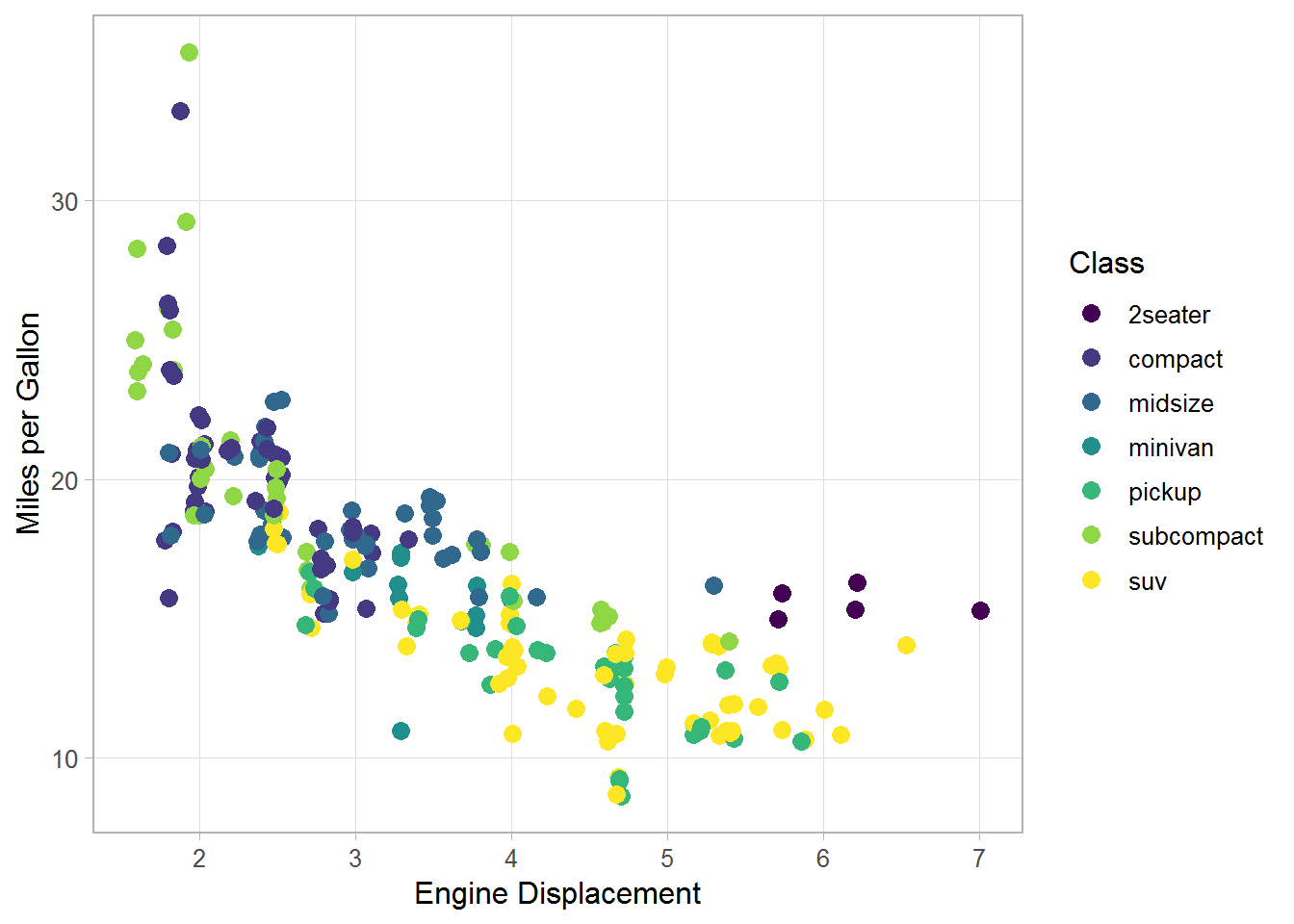
Second, I will use different shapes for the groups. As you can see in the plot, it is a little bit easier to tell the groups apart, and we can now identify the 2-seaters. However, ggplot2 allows for only six colors as described in the warning, and the SUVs get completely removed from the plot.
p1 + geom_jitter(aes(shape = class), size = 3, position = jit)
#> Warning: The shape palette can deal with a maximum of 6 discrete values
#> because more than 6 becomes difficult to discriminate; you have 7.
#> Consider specifying shapes manually if you must have them.
#> Warning: Removed 62 rows containing missing values (geom_point).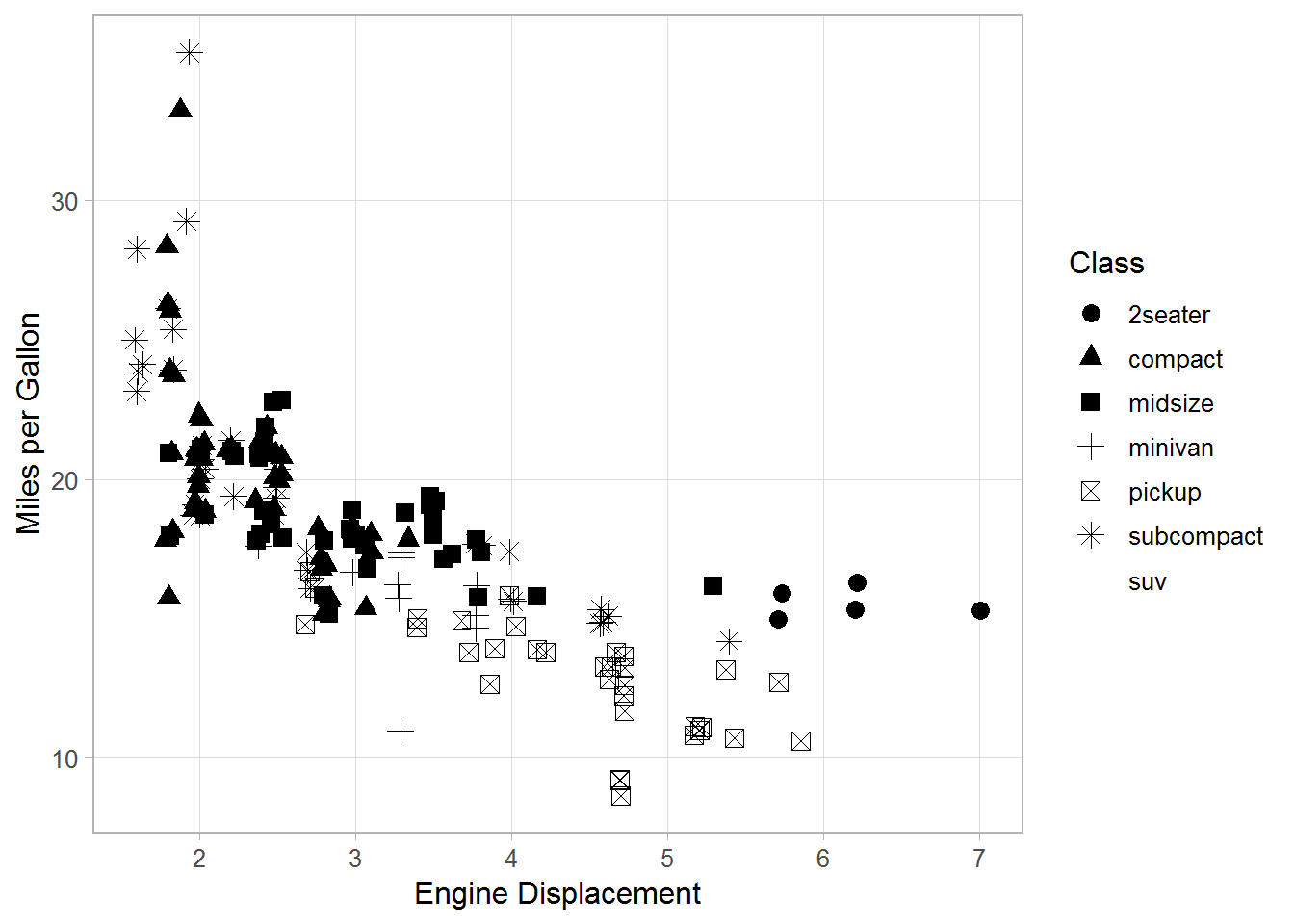
Third, a possible solution to this problem is to use both different shapes and different colors for the groups, which can be achieved using scale_shape_manual().
Here, I use seven different colors combined with three different shapes.
As you can see, it’s quite easy to spot the 2-seaters.
And also the classes compact and midsize are relatively easy to tell apart, which was rather difficult in the first plot using only color.
p1 + geom_jitter(aes(shape = class, color = class), size = 3, position = jit) +
    scale_shape_manual(values = rep(15:17, len = 7))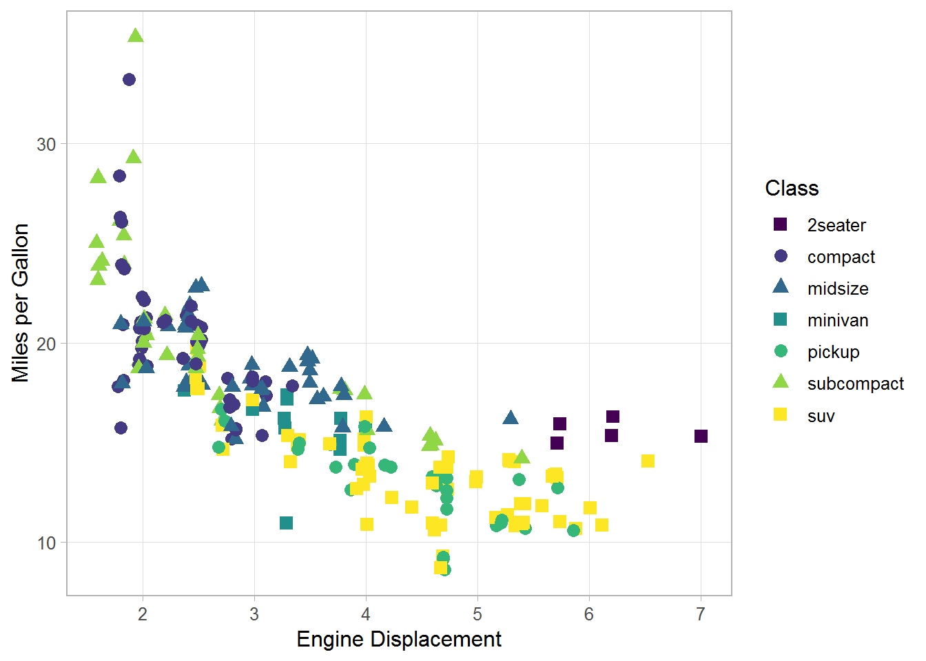
The combination of color and shape is especially useful if you have to print your plots in grayscale. While its almost impossible to identify most groups in the left plot, it is much better even though not perfect in the plot on the right.
library(cowplot)

p2 <- p1 + geom_jitter(aes(color = class), size = 3, position = jit) +
    scale_color_grey(guide = guide_legend(nrow = 3)) +
    theme(legend.position = "bottom")


p3 <- p1 + geom_jitter(aes(shape = class, color = class), size = 3, position = jit) +
    scale_shape_manual(values = rep(15:17, len = 7),
                       guide = guide_legend(nrow = 3)) +
    scale_color_grey() +
    theme(legend.position = "bottom")

plot_grid(p2, p3)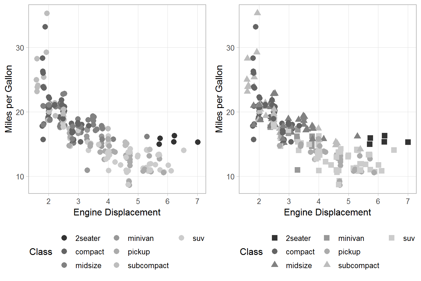
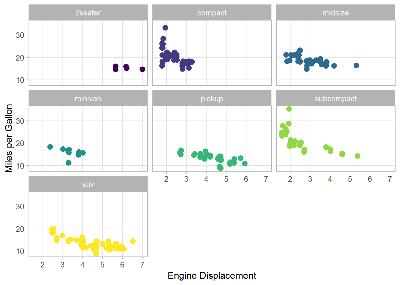
From a puristic point of view, it might not be correct to use two different aesthetics (shape and color) for one variable. But from a practical point of view, I think this can help in certain situations with an intermediate number of groups, say 7–12. Of course, a possible alternative are facets, but the faceted plot may not meet your needs in all situations.
p1 + geom_jitter(aes(color = class), size = 3, show.legend = FALSE) +
    facet_wrap(~ class)